|
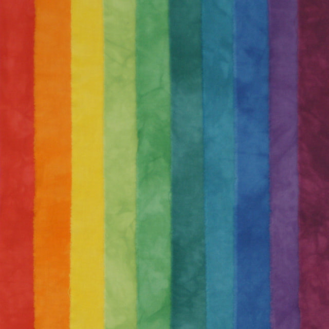
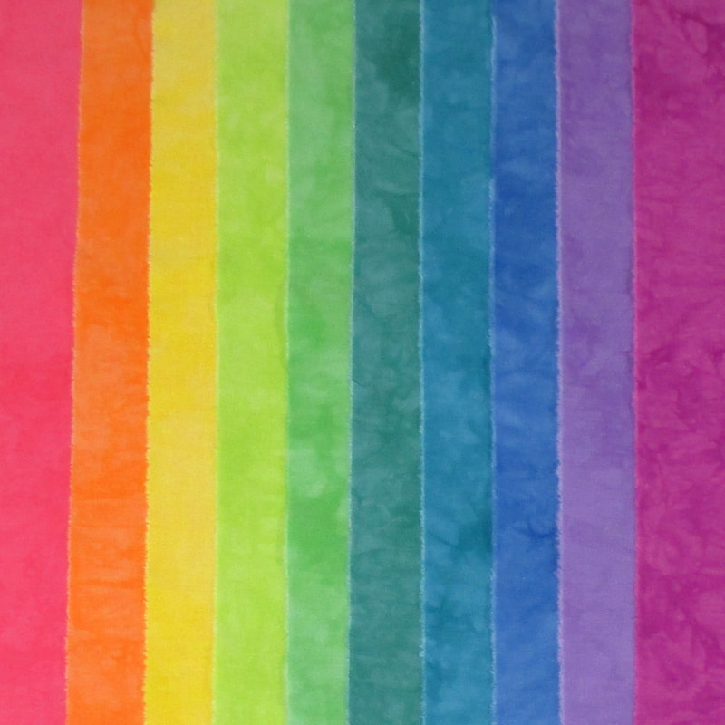
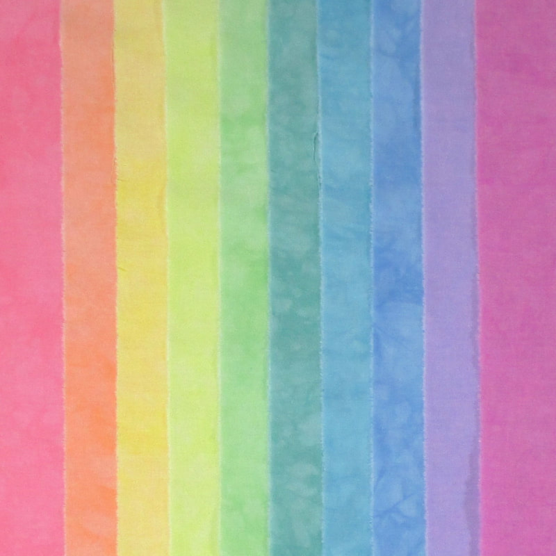
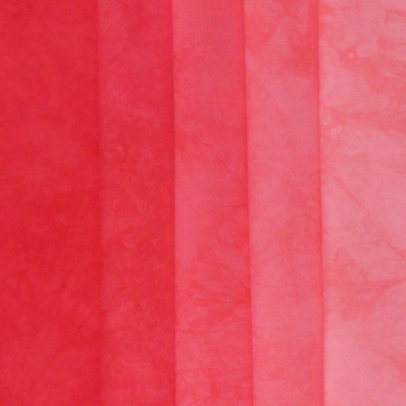
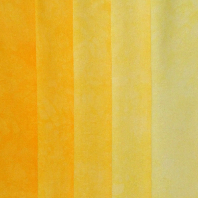
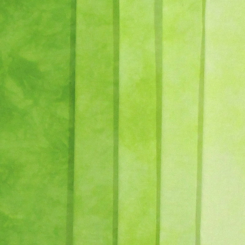
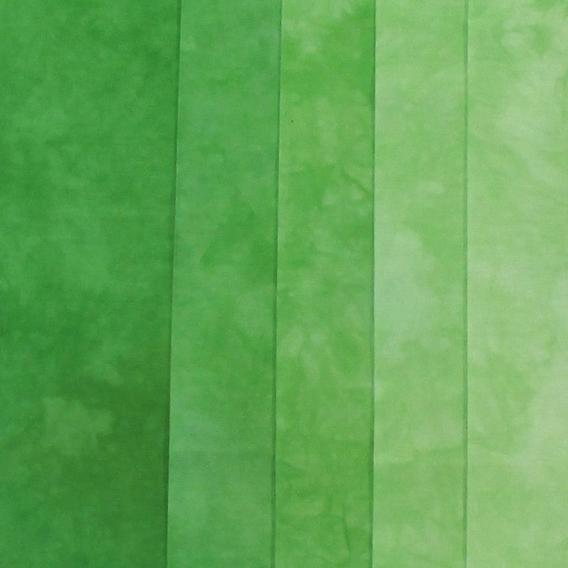
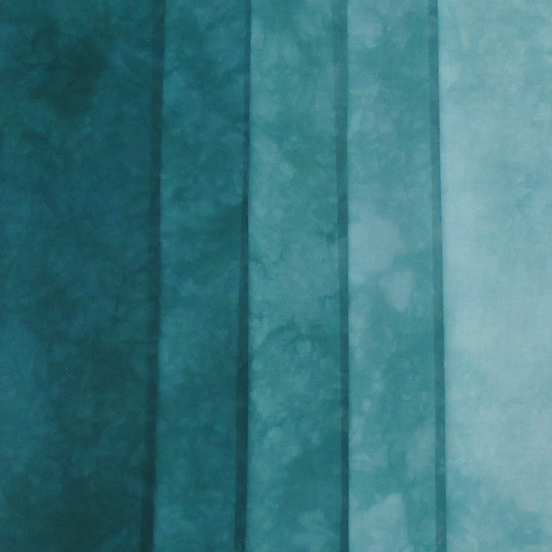
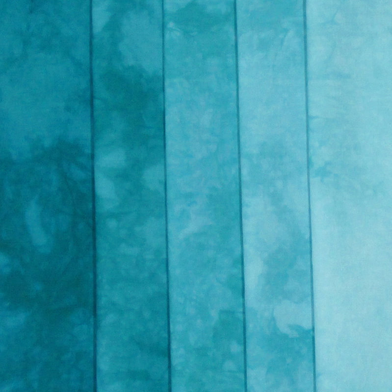
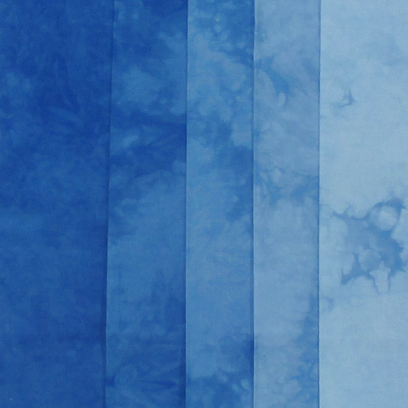
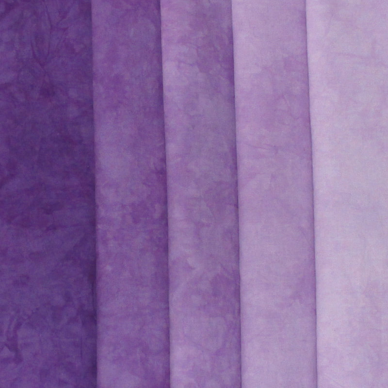
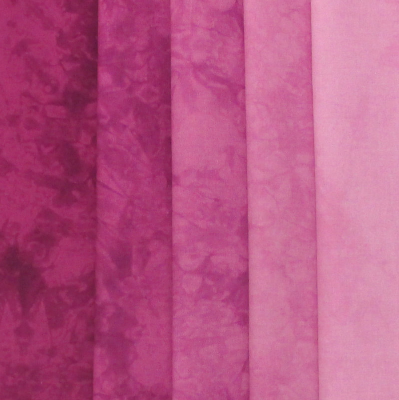
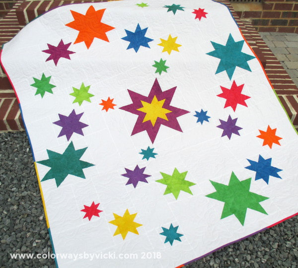
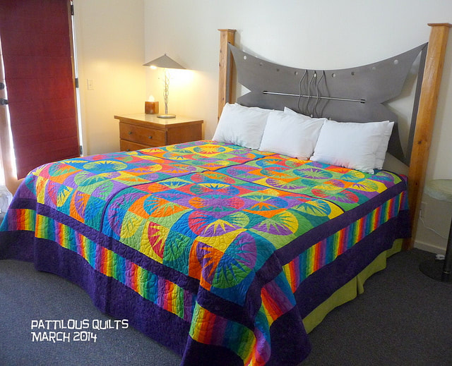
Many years ago I pursued a self-study program in color theory. I got completely obsessed about it, studying several textbooks, taking classes and even consulting with a local art professor about my thoughts on different systems. In the end I felt that the Munsell system was the most appropriate for use in design work. Most other systems are based on the colors that we mix, whether it's printer ink, dye or paint. Conversely the Munsell system is based on how we perceive color. It doesn't matter how the color is created. Instead it about how we uses the colors that we create (or buy). It just made sense to me and that's the system that I used to create my Color Wheel fabrics. Color Wheel BasicsThe Color Wheel Fabrics are a set of 10 fabrics based on the Munsell Color System and these fabrics are on sale every day for 20% off! There are fat eighth stash packs of light, medium and dark plus fat quarter and half yard sets of the dark sets. I can dye the fabrics for you in any size and the discount always applies. Shades PacksIn the Munsell system there are 5 primary colors (Red, Yellow, Green, Blue and Purple) and 5 secondary colors. I've created Shades Packs of each of the 10 color and these are also always 20% off! Here are 2 quilts that have been made with the Color Wheel fabrics. Stars at Sea is a quilt that I made using the Stars at Sea pattern by Swirly Girl. I believe I used one set of Fat Quarters for the stars and border on this quilt and, yes, it's been washed and the colors didn't bleed. This beautiful quilt was made by Pat Ferguson using the Color Wheel palette with a deep dark purple for sashing.
The Color Wheel fabrics are a great way to introduce someone (or yourself) to the joys of using hand dyed fabrics. 4/21/2020 09:21:51 am
They're lovely - so many possibilities! When I worked in color approval for a major fashion retailer, we used a variant of the Munsell system in colorimetry with four primaries, red, yellow, blue, and green. Using a spectrophotometer to measure color, we could determine a precise match or give comments to correct for a better match. We could even provide the digital color standard data to certain mills who would upload it into their dye recipe software and it would generate the first lab dips, which were more often than not approvable on the first round. Pretty cool! Your fabrics are much more artistic and your customers make lovely works of art with them.
patty
4/21/2020 10:07:06 am
A very colorful post! Both of the quilts are gorgeous!
Gene Black
4/22/2020 08:31:35 am
I agree that "how we perceive color" is the more important aspect. I remember being in an art painting class and the teacher trying in vain to explain warm and cool colors. Some were marking their paints "warm" or "cool" - but of course it is relative to what you place it against. Then later when she used one of the "cool" colors as the "warm" tone in another demo, the became more confused. 4/22/2020 01:52:11 pm
Do you have a starter book you recommend about the Munsell system? This all sounds very interesting. Love that quilt on the bed Comments are closed.
|
FeedsTo subscribe click the RSS Feed button and copy the URL of that page into your blog reader.
In Bloglovin you need to search "Colorways By Vicki Welsh" to find the blog. About Vicki
I'm Vicki Welsh and I've been making things as long as I can remember. I used to be a garment maker but transitioned to quilts about 20 years ago. Currently I'm into fabric dyeing, quilting, Zentangle, fabric postcards, fused glass and mosaic. I document my adventures here. Categories
All
Archives
July 2024
|

 RSS Feed