|
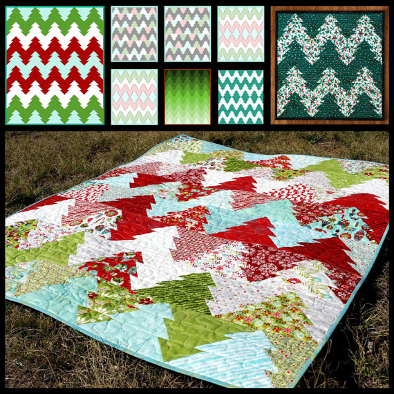
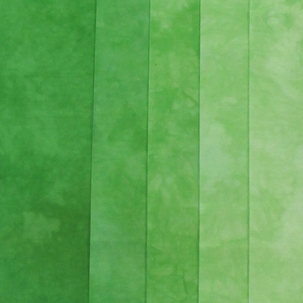
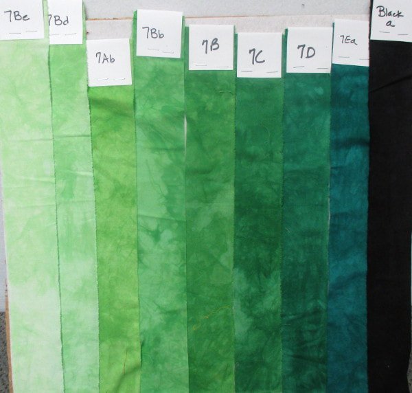
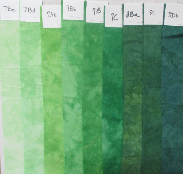
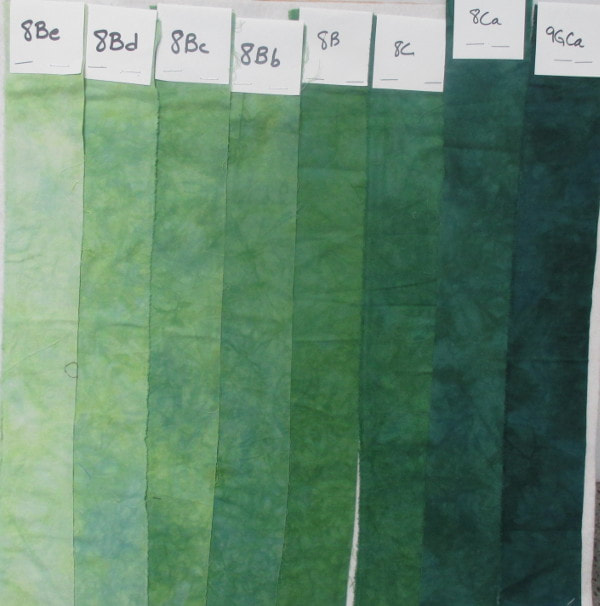
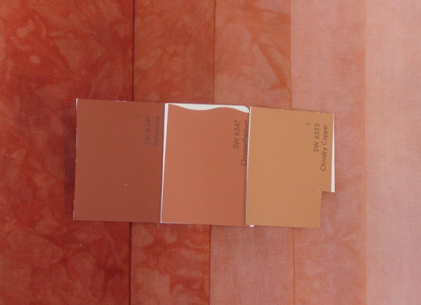
Since I can't share what I'm sewing I thought that today I'd share what I do when someone contacts me for a custom palette. This one was pretty straight forward. A customer contacted me about making this quilt. She wants to make the green gradient version. But I didn't know that. The request came through that she wanted this fabric in 9 steps. The problem with that is that the dark green in the image is the darkest possible shade so the other 4 steps would be lighter. I know from experience that those last 3 steps would be so light that you would hardly be able to tell them apart. So before I do a custom dye order I'll ask what the fabric is going to be used for. In this case she sent me a link to the pattern above and once I saw the gradient version I knew that what she asked for wasn't really what she wanted. My job was to put together some options for her. This is where my color swatches come in handy! First I pulled out the swatches for the color she selected. Those are the 7B samples (7Ab is in there because I'm missing 7Bc). Then I added darker shades from the same green family. By that I mean that all of these greens are made with the same yellow and blue just in different ratios. I also added black because she was considering black as the darkest color. I'm not really fond of that idea. I think it's way to stark. I prefer the darker colors to be more blue. For this sample I started with the same base green (7B) but as I went darker I switched to another green for the darker shades so that there would be less blue. For the last sample I picked a different green just to give her another option. This is a darker base green (8B) so I could go even one step lighter on the light side if she wanted. Here's another custom order that I've done recently. This customer needed a color matched. I focused on the dark and medium paint chips. Her lightest shade is actually a different color and I could pull that color from my Copper Mine gradient. The darker paint chip was the challenge. I had colors that were close but not close enough. This is a more complex color because it involves mixing 3 colors: a red, a yellow and a blue. Too much blue and it goes purple, too much yellow and it goes brown. There are also 2 yellows and 4 blues to choose from. It took a few weeks but I eventually got this and she's happy!
These are the things I love doing. I love it when people ask me to create new colors or palettes. Occasionally I can't do what they want but I'm always willing to give it a try. The next one I'm working on is seriously complex and involves about 40 different fabrics. We'll see if I'm able to get that one.
Gene Black
9/28/2017 07:41:39 am
wow. You are really precise with your color matching!
patty
9/28/2017 11:20:59 am
It was masterful to figure out how to help that customer figure out what she really needed. My Mom wanted a graduated green for a quilt she was making. I needed to match a commercial print she had bought. I sent a piece of the fabric to ProChem and they told me what dye to use. Yes, I took the easy way out! LOL!!
Mary Anne
9/29/2017 10:50:31 pm
I can see why you would enjoy the challenge but matching 40 different fabrics must be mind-boggling. Comments are closed.
|
FeedsTo subscribe click the RSS Feed button and copy the URL of that page into your blog reader.
In Bloglovin you need to search "Colorways By Vicki Welsh" to find the blog. About Vicki
I'm Vicki Welsh and I've been making things as long as I can remember. I used to be a garment maker but transitioned to quilts about 20 years ago. Currently I'm into fabric dyeing, quilting, Zentangle, fabric postcards, fused glass and mosaic. I document my adventures here. Categories
All
Archives
July 2024
|
 RSS Feed