|
I've got another set of star points done. Only 2 left to go. 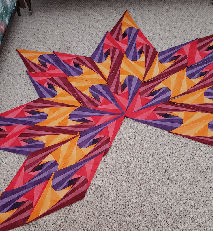 I've got both quilts arranged differently now so I can start to think about how I want them finished. The big start is arranged with red for the center. 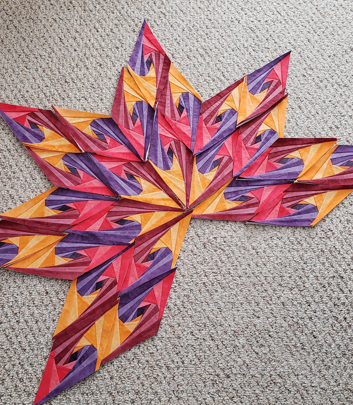 The little star is arranged with gold as the center. Do you have a preference? I think I do but I'd love to hear your thoughts.  I also cut out the next doll outfit that will be included in the RSC for pink month.
Claire Christiansen
1/21/2021 10:36:28 am
I prefer the red in the center. For some reason the yellow in the center makes the whole thing look washed out.
Kristin F
1/21/2021 11:41:11 am
I can't decide which I like better. At first, I was thinking the yellow in the center, but then I read the other comment. But maybe it's the lighting that's making it look washed out? They both look great.
Peg S.
1/21/2021 01:33:54 pm
The star points are looking great! I definitely prefer red in the center - it has more energy. 1/21/2021 01:37:35 pm
Guess I'm the odd-man out - I like the yellow in the center better than the red - LOL - ;))
Mrs. Plum
1/21/2021 01:57:12 pm
My preference is the yellow center. Hope you enjoy sewing the doll outfit!
PamO
1/21/2021 02:50:07 pm
I like red in the center because the yellow becomes a glow ring around it. I think the yellow is too light in the center.
Pamela North
1/21/2021 03:46:16 pm
I like the yellow in the centre because I think the ring of red which follows it is more dramatic and leads the eye outwards. Finishing the tip with the red gives a sharper point as well.
patty
1/21/2021 08:12:33 pm
No preference - either layout looks wonderful!
CindyPilkington
1/22/2021 08:22:03 am
They both look good. Maybe the decision will be made once you consider your background fabric.
Gene Black
1/22/2021 08:33:39 am
I like the red in the center best. It looks more intense to me. Also I think "star = fire" and fire is usually red in the center with yellow at the tips....like the big star.
Sylvia Anderson
1/22/2021 08:52:56 am
Why can't you just do one of each? They are both so beautiful, and can definitely stand on their own, but if I had to chose one, it would be the red. The smaller one, with the yellow, gives more of a Kaleidoscope effect.
Mary Anne
1/22/2021 10:34:01 am
It's hard to choose but I think I would opt for the red in the center. My reasoning is perhaps strange but it involves more the fact that I prefer the color red over the yellow so I would rather my eye be drawn to it in the middle.
Laceflower
1/22/2021 11:59:37 am
I like the red in the center because of where the yellow is then placed; first a predominant ring and then on the tips, draws the eye outward emphasizing the star shape.
Alycia Quilts
1/23/2021 05:40:10 pm
These are turning out so COol!!
Andrea in MO
1/25/2021 09:31:23 am
I think I like the red in the center, because I like the yellow circle it creates. It also has an overall lighter feel to me. I don't think you can go wrong either way. My opinion could change based on background, though. I've forgotten if you've mentioned what color that was going to be.
Rebecca
1/25/2021 02:30:48 pm
I prefer the red center; I have since I first saw these. The red on the tips just seems to deaden the star. Comments are closed.
|
FeedsTo subscribe click the RSS Feed button and copy the URL of that page into your blog reader.
In Bloglovin you need to search "Colorways By Vicki Welsh" to find the blog. About Vicki
I'm Vicki Welsh and I've been making things as long as I can remember. I used to be a garment maker but transitioned to quilts about 20 years ago. Currently I'm into fabric dyeing, quilting, Zentangle, fabric postcards, fused glass and mosaic. I document my adventures here. Categories
All
Archives
July 2024
|
 RSS Feed